 noteboard
1. Write what the design needs to help someone do
Name the audience and the action the design should support. For our studio website, a potential client needs to browse the work, understand the service, and know how to get in touch. Those jobs give you a way to judge a reference beyond whether it looks appealing.
Write down the conditions the design has to work within. The studio uses an existing logo, has a small collection of project photographs, and needs a site that reads well on a phone. If a visual idea requires material you don't have, record that before it becomes part of the direction.
Add a few words for the intended tone, then define them. “Approachable” could mean plain language and photographs that show how the studio works. “Thoughtful” could mean careful image selection and enough space to read. These explanations help collaborators picture the same thing.
2. Collect a reference for each design question
Separate the questions you need the moodboard to answer: how the type should feel, what the photography should show, how color will be used, and how dense or spacious the composition should be. You can group the references under those headings.
For each image, write what you're borrowing from it. A magazine spread might be useful for its hierarchy, even if its typeface would be wrong for the site. A workspace photo might show the lighting you want without matching the objects in the studio. That note helps prevent a reference from becoming a vague instruction to copy the whole design.
Use original material where possible and keep source details with external references. In Noteboard.ai, upload the images or add source links, then crop to the relevant detail. A close crop can make a spacing or texture reference easier to understand than a full screenshot.
3. Choose a set of references that works together
Review the collection as a whole. An ornate type reference may pull against an otherwise simple, practical site. Decide whether that contrast is intentional. If it isn't, save the alternative separately and keep the main board focused on the chosen direction.
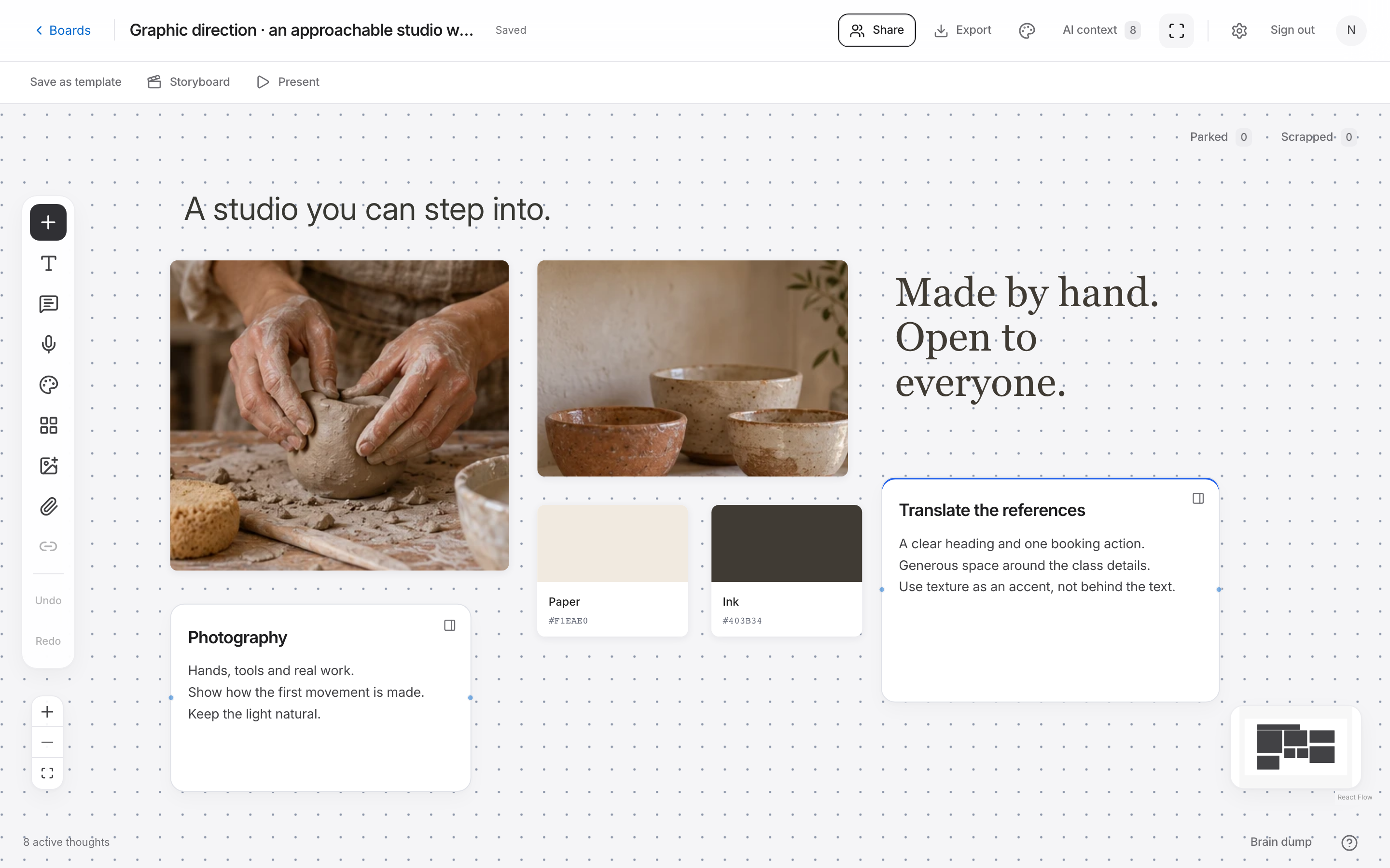
Add named color swatches and explain their roles. The studio might use a warm background, dark text, and a restrained accent for links. Keep any exact values beside the swatches, but leave room to adjust them when you test contrast and real page layouts.
Give the most important references more space, then align supporting material around them. A design inspiration board is easier to review when the visual hierarchy reflects your decisions. An equally sized wall of images can make it hard to tell what should lead.
4. Turn the references into design instructions
Write a short description of how the direction should appear in the work. “Use natural-light project photography and clear, dark headings” is easier to apply than “make it warm and editorial.” Add the design questions that the moodboard cannot answer on its own.
For the studio site, the next check is a rough project page using actual images and copy. Can someone understand the service and find the contact link? Does the typography still read comfortably on a small screen? Keep those checks beside the direction so the team knows what to try in the prototype.
Share the board or export a PNG or PDF for review. Once choices are agreed, keep the production files in the appropriate design tool and link them back to the brief. The board remains a useful reference for the reasoning behind those files.
Example: review a studio website moodboard
The illustrated moodboard above uses natural materials, a neutral palette, and studio photography. Here is how those references could become instructions for a fictional website. The rules are starting choices to test with the studio's actual work.
Use Noteboard.ai presentation mode to review the brief first, then the references, then the proposed rules. Ask where a choice helps or interferes with the visitor's task. Record the approved direction and the remaining questions beside the relevant group.
| Reference | Design instruction | Check in the layout |
|---|---|---|
| Natural-light studio images | Show tools, people, and work in context | Can visitors see the project clearly on a phone? |
| Simple editorial typography | Use a clear hierarchy and short headings | Can someone scan the services without reading every paragraph? |
| Warm neutral palette | Keep the background quiet so project imagery leads | Are text, links, and controls easy to distinguish? |
| Spacious page composition | Separate the project story from supporting details | Does the contact action remain easy to find? |
What to do with conflicting feedback
Ask the reviewer to connect a preference to the audience or the task. “This photo feels too formal for first-time clients” gives you something to discuss. “I don't like it” needs another question before you can make a useful change.
If two people picture different directions, make the difference visible in a separate group. Compare the alternatives against the same brief, choose which to explore, and write down why. Mixing both directions into one board can hide the disagreement until production.
An AI prompt for this workflow
Using these written design goals, identify tensions between the audience, intended action, and proposed direction. What should we test in a prototype?
Can I plan graphic design and app design on the same kind of board?
Yes. Adapt the questions and references to the project. Use a specialist design tool for production artwork and interactive prototypes, and keep the brief and direction together on your board.
Try this in Noteboard.ai
Keep imagery, typography references, color swatches, and design notes together.
Explore Moodboards