 noteboard
1. Decide what the moodboard needs to communicate
Write who the work is for and where it will appear. A studio website, a film scene, and a room renovation each ask different things of a moodboard. For our example, the studio wants a website that makes first-time workshop visitors feel comfortable enough to find a session and book.
Choose a few descriptive words and explain what they mean here. “Warm” might mean natural light and familiar materials. “Clear” might mean simple type and a visible booking link. Without that explanation, two people can agree on a word while imagining very different work.
Add any useful boundaries. The studio has its own photographs, uses an existing logo, and needs the work to remain readable on a phone. Keep that brief beside the references so you can check the collection against the job it needs to do.
2. Collect images and explain what you want from each
Look for references that answer a design question. You might need one for lighting, another for a material texture, and another for the balance between images and text. An image can contribute one useful detail without becoming a model for the whole project.
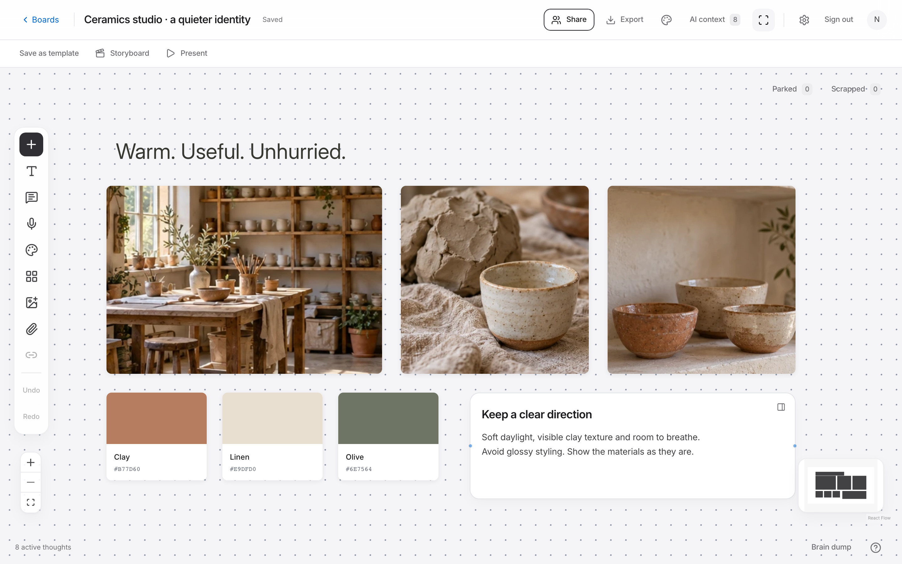
For the studio, collect a natural-light workspace photo, a close view of clay or linen, a simple editorial layout, and a small set of colors drawn from the materials. Add a note such as “keep the hands and tools visible” or “use this amount of space around a heading.”
Use your own material or references you have permission to use, and retain their source details. In Noteboard.ai, upload, paste, or drop images onto the board and write the reason beside each one. Avoid relying on memory to explain why an image was included.
3. Edit the references into one direction
Review the collection against the brief. Remove an image if it repeats another reference without adding anything, or if you can't explain how it belongs. You can save appealing alternatives on a separate board without forcing them into this direction.
Give the image that best represents the direction enough space to lead. Place supporting textures, colors, and type references nearby. Use crop or fit to show the useful part of an image, then align related items. The layout should make the relationships easy to read.
Add named color swatches and a few short notes about how the colors would be used. A dark ink for text and a warm paper color for backgrounds explain more than a row of unexplained hex codes. When looking at mood board examples, pay attention to these choices as well as the images.
If the moodboard feels inconsistent
Return to the brief and describe the conflict plainly. Perhaps one photograph feels formal and distant while the others feel informal and close. Decide which quality serves the audience, then replace the reference that pulls the board in a different direction.
If everything feels similar but the board says very little, check the range of references. Five near-identical photos may establish a mood but leave typography, composition, and color unanswered. Add the missing kind of reference rather than collecting more of the same image.
An AI prompt for this workflow
Based on these written direction notes, suggest three questions to check whether this concept fits the audience and brief.
What should a moodboard include?
Start with a short direction statement, a small set of image references, a color palette, and notes about typography, texture, or composition. Explain the quality you want from each reference and keep the overall direction coherent.
Try this in Noteboard.ai
Bring your images and color references onto a board, then add a short explanation of the direction.
Explore Moodboards